Marco Polo has a brand new look!

No, your eyes aren’t playing tricks on you. Marco Polo has a brand new look. We’ve updated our logo and refreshed our brand colors to improve accessibility and the experience in the app for everyone. But don’t worry, while our appearance may have changed, our purpose hasn’t. We’re still here to help you feel close to the people who matter most, and our commitment to your well-being remains at the heart of everything we do. This new look is simply a reflection of the thought and care we’re bringing to the app and our community as we grow together.
Our new logo

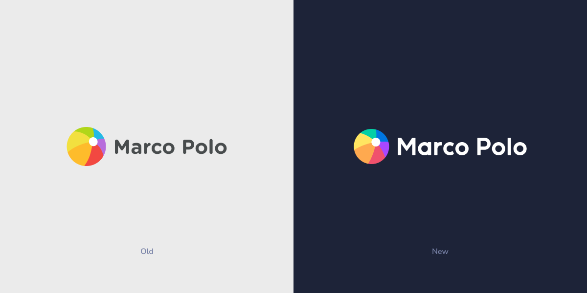
It’s subtle but the change is significant. You can see the new colors in all their glory in our new logo. Our designers also reconstructed our beloved beach ball using a circular grid, creating better proportions and balance. Keep an eye out because we’ll be replacing our iconic beach ball across the app and the web in the coming months.
Our new colors

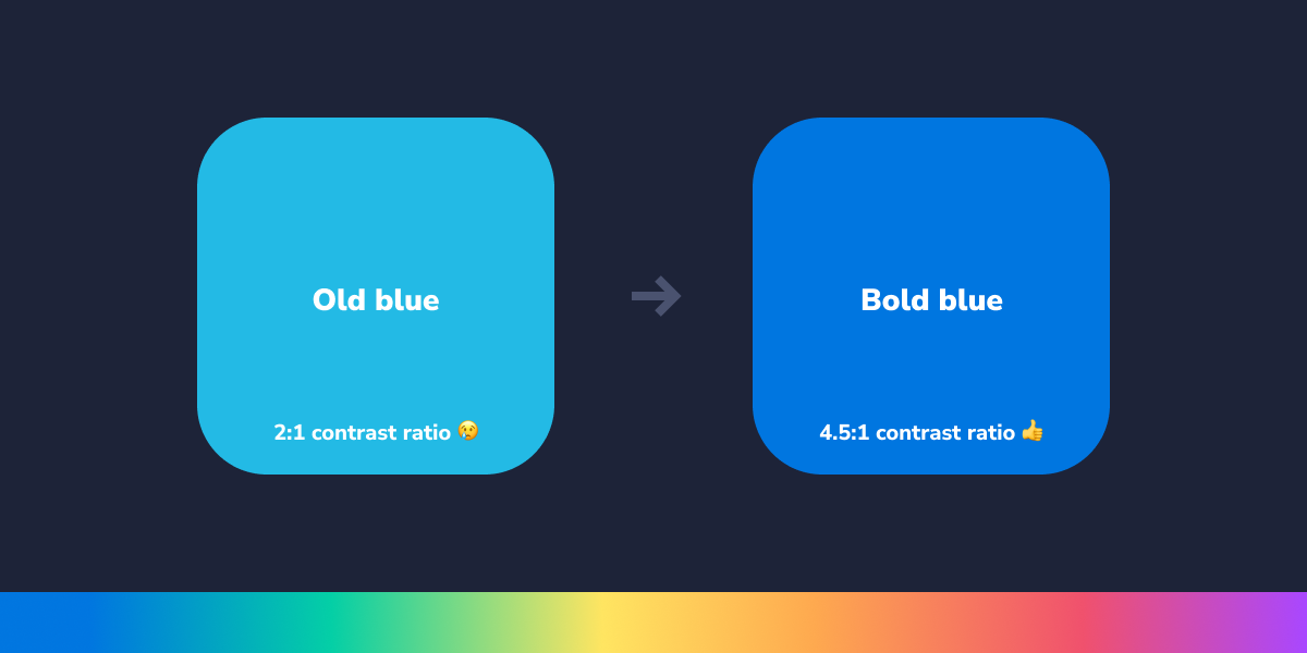
The major driver of our new brand colors was improving accessibility for our community. Our old colors were fun but they didn’t provide the best contrast in the app. It made navigation difficult for some users. Our new colors and typeface enhance readability and contrast, improving the experience in the app for everyone in any environment.
Our new logotype

We custom-built our new logotype from the ground up. Bold and joyful, we think it strikes a wonderful balance between staying true to our history and looking forward to an exciting future.
We’re incredibly excited about this change. Sure, It’s just a little spruce up but it also represents our continual focus on evolving our brand and pushing our product forward. It’s our way of saying that we’re committed to building a platform that will be here for years to come, one where you can feel close to the people who matter to you without having to compromise on trust.
Thank you so much for being a part of our community. Thank you for trusting us with your most important relationships. We hope you’re as excited about this new look as we are.